During the visual identity course where an image
designer was assigned to a garment student, I got
paired with Ellen Haese, a young fashion designer
who wants to launch her own label.
I developed two graphical propositions and illustrated
the results on an extended set of supports related to the bra
nd’s needs.
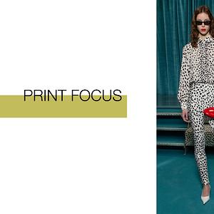
Ellen’s Haese work is recognised by her femininely draped silhouettes that are often pastel colored. Ellen grew up in Germany, in a part of Berlin where, many
houses were designed by Bauhaus architects, that’s how Ellen became fascinated by minimalistic shapes and clean lines without any decor. This minimalist approach guides her work: we can always feel tension between geometric form and organic shape.
I decided to represent the duality
between geometrical form and more feminine curves
in the logo type, with this atypical H and ending of letters.
I used images from Ellen’s collection and created some
gradient directly inspired by her use of many shades of one color in her designs.
Fashion, Graphic Design, Typography, Packaging, Visual Identity & Logo, Branding